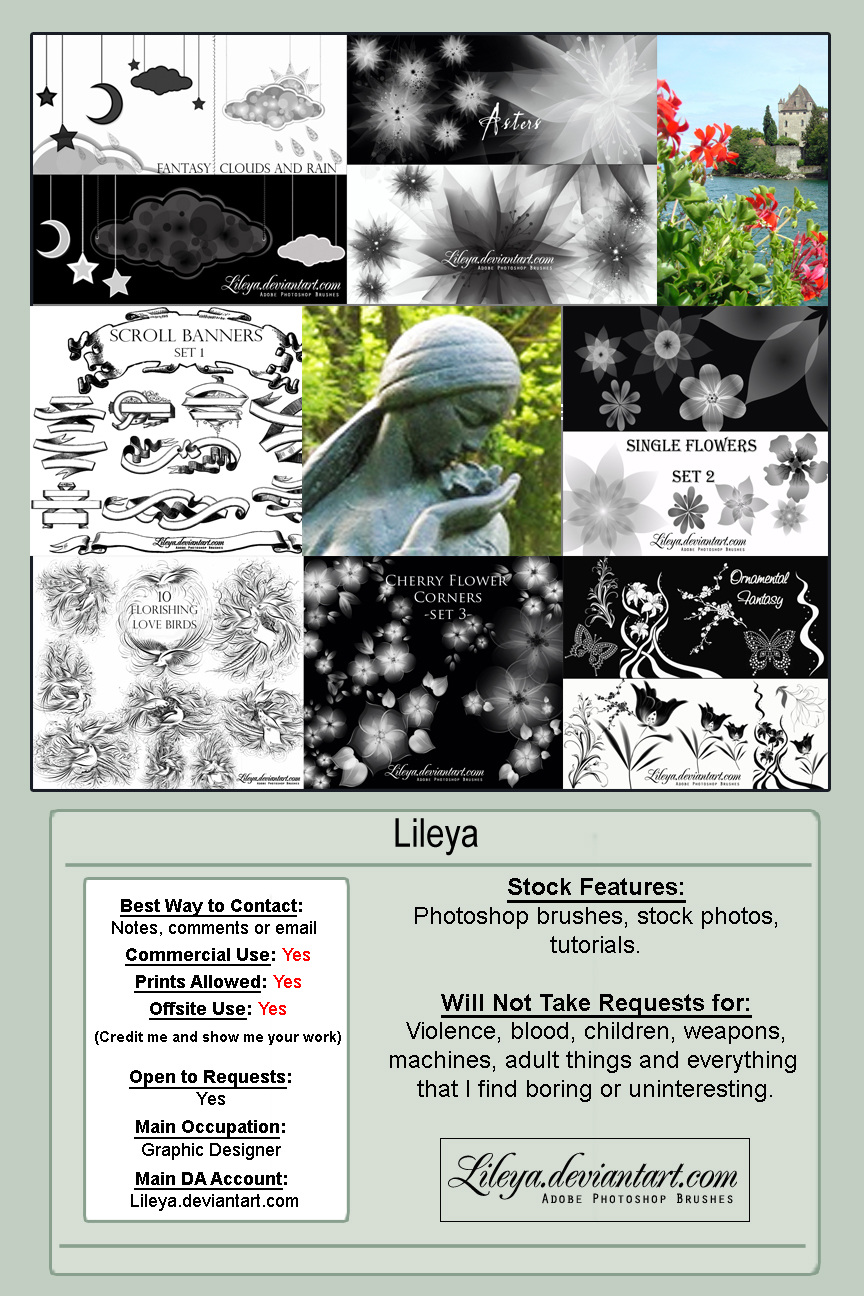
 ©Doreen Erhardt Dash of Inspiration Post for GCU Community Blog Here’s a great tip: Even if you’re designs have the year as Custom Text, if you used a year that has gone by, take the time to update those cards. Any card that is out of date will be ignored by a large percentage of customers. I tend to ... Read Full Article and Get Links
0 Comments
 © Doreen Erhardt Dash of Inspiration Post for GCU Community Blog Today I offer a few links to some fun goodies that will inspire you to think about Dad while making your designs for Father's Day ... Read Full Article & Get Links 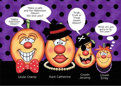 ©Doreen Erhardt Dash of Inspiration Post for GCU Community Blog I’ve created hundreds of Custom Front cards for GCU and as ALL design software, GCU’s personalization software has it’s own little quirks that you can learn to work around. So I thought I’d offer a few tips ... Read Full Article & Get Fonts! 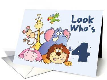 ©By: Nancy's Nook Dash of Inspiration Post for GCU Community Blog When creating birthday cards for children, here are some tips to keep in mind: Design for a Specific Age-Group In other words ... Read Full Article & Get Fonts  ©Doreen Erhardt Dash of Inspiration Post for GCU Community Blog I hope that last week’s Part 1 of Christmas in July inspired you! Today we continue the holiday theme with some thoughts and goodies for your holiday creations ... Read Full Article and Get Links! 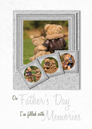 ©Doreen Erhardt Dash of Inspiration Post for GCU Community Blog I think the most difficult area for me when I first started designing cards was the Typography. I must have gone back and reworked the text on some of my early designs three or four times over the years as my knowledge of placement, legibility and font-base grew ... Read Full Article & Get Fonts 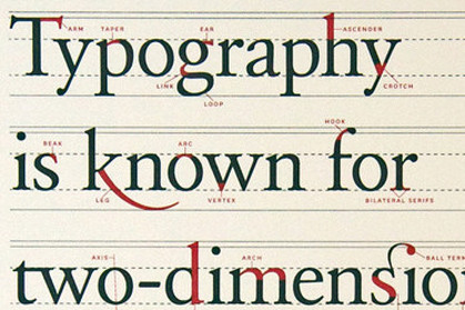 Image courtesy of SmashingMagazine.com Dash of Inspiration Post for GCU Community Blog I think you’ll see here how important typography is to the overall design and that it should be kept in the forefront of the designer’s mind from the early moments of creating that design, particularly in greeting cards where both imagery and message are paramount to the customer. Typography should NEVER be an afterthought on the card face that gets stuffed wherever there is space left, the designer should know at the beginning of their card design where the text will go, what it’s visual attributes will be and how it will convey the message of the imagery it shares space with ... Read Full Article & Get Links 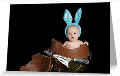 Image by Sharon Bree© Dash of Inspiration Post for GCU Community Blog Keeping it simple this week with a focus on images to inspire Easter creations and some tools to get you started ... Read Full Article & Get Links 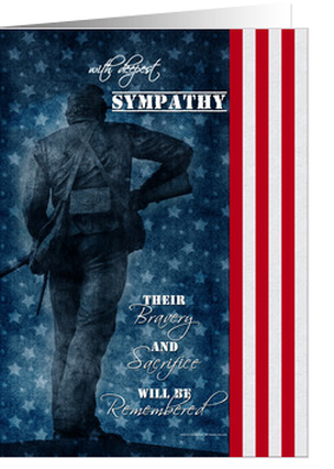 ©Doreen Erhardt Dash of Inspiration Post for GCU Community Blog Some of you may know that within the past couple of years there has been a camouflage copyright battle going on with the military claiming all rights to the use of camouflage patterns on clothes. I asked about the camouflage-use policy at GCU a few months ago and the wise team of experts who investigate these issues informed me that as of this point in time, GCU will allow the use of camouflage patterns on cards ... Read Full Article and Get Links to Brushes 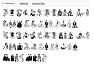 Image courtesy of FontRiver.com Dash of Inspiration Post for GCU Community Blog Though I DO NOT recommend using the majority of the Dingbat Fonts you find as is on your greeting cards, they can offer your imagination a very creative outlet. Here are some ideas for having dingbats in your artist’s toolbox. In my book there are two types of fonts which fall into this Dingbat category ... Read Full Article and Get Links |
Resources
Here we archive our Photo Tips, Tutorials, Marketing Tips and Preset Downloads from all our sites. ENJOY! Categories
All
My favorite
|


