|
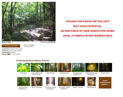
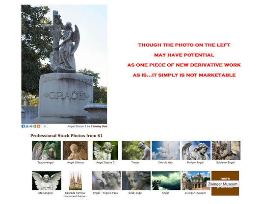
Guide to a Winning Photograph Photo Tips from May & June 2011  "Sand Man" ©Doreen Erhardt I remember my amateur days in photography. What I looked forward to the most in those early days was receiving constructive criticism from all the experts along the way. Some of those were my teachers during my 4-years of studying photography; some were members of the Photographic Society of America where for 10-years I participated in offering critique to other photographers as well as received critique on my own work. All these lessons were invaluable to me and were stepping stones to becoming classified as a Master Photographer, being the recipient of a Lifetime Achievement Award in the Art & Science of Photography and winning hundreds of ribbons over the years. This is where my background comes from as I step into this area of offering guidelines for winning photographs. Anyone can take pictures, but to create photographs that are winners, there is much more to it than simply pointing the camera at something and clicking the shutter. What I will try to offer here is the means to evaluate your photos with the eye of a professional. In order to be competitive in competitions, be accepted on stock photo sites and actually make money on your photography you need to know what makes a winning photograph and arm yourself with the knowledge to be your own worst critic. There are thousands of photographs cluttering Print on Demand sites that will most likely never sell; these poor quality snapshots have zero marketability. It doesn't mean the person who is selling a poor quality snapshot can't take a winning photograph, it simply means they don't know how to evaluate their images to determine which are marketable and which should be post-processed, or sometimes even rejected. To properly judge an image for it's merit as a winner, you must put aside your own connection to the photograph. The viewer does not know, nor do they care, that it's your dog. The viewer will be distracted by the sofa cushions and floor lamp in your photograph. You as a photographer have to learn how to rate your own photographs and properly judge the technical faults as well as the ability for the photograph to evoke a feeling in the viewer. I have been a photographer for more than 35-years and I have thousands of photographs the world will never see as they were shot. These 'rejects' of mine as should yours are put aside and used as elements in new digital creations. Guideline 1: A Photograph Must Evoke Emotion  Leaf Motif © Doreen Erhardt 2011 Look at the example above: The photo of the woods in the upper left is not only technically imperfect, the poor lighting and lack of subject make it emotionless. The average person would not feel anything when viewing this photograph. Now look at the professional photographs of similar subject matter and notice the difference. In every one of those images, the photographers have captured a statement, something to be felt by the viewer...it may be a different emotion from viewer to viewer but that's even better! What is critical is that when your photograph is viewed, people FEEL SOMETHING. Landscape photography is actually one of the most difficult subjects to render. A good scenic photograph either evokes a mood or makes the viewer want to be there. As we stand in the moment with our camera in hand, we feel the emotion because our senses are keen to the smells, the feel of the air, and the sounds of nature. However, when captured as a photograph it easily becomes one-dimensional so all the viewer will experience is the vision. Guideline 2: Is the Subject Well-Lit? Was the Mood, Texture & Form Captured? Before you shoot the picture, evaluate the lighting; is it exceptional? Will it create a mood? Find the forms that make the scene. Can you place them in a composition that draws the eye in and back out of the finished photo? Look for the texture that you so easily see with a naked eye. Can you find a way to capture those textures as part of your image and make the viewer want to touch what you've recorded? Guideline 3: What is the Subject of the Photograph?  How the subject stands out in a photograph, giving the viewer an 'in your face' presentation of what the photograph is all about; can make a winning photograph or create a photo for the reject file. Look at the Angel images above. The one in the upper left is a snapshot. The subject clearly is the statue, however the lighting is poor and the background is distracting only because it does let the subject pop and adds no value to the composition. This is a fine photo to document the statue, but it's not going to win any competitions or even sell in the marketplace. The thumbnail examples below that image give you a good idea how to focus in on the subject and tell a story. Every one of those professional images of angel statues tells a story and opens your mind to let your own emotion depict how you feel when viewing them. Guideline 4: Avoid Distracting Elements, Clutter and Chaos The photo above right is a typical snapshot. The kids are cute, but what IS the subject? It's cluttered, manic and belongs only in the scrapbooks of the people in the photograph, yet I see these types of photographs for sales on POD's all the time. As a general rule of thumb your subject needs to take up at least 1/3 of the image to really have impact on your audience. This is particularly true if your goal is to sell the image in small format; such as greeting cards. You may see the toad in the dried grass or the bird on the branch from 50-feet away, BUT if you didn't know it was there, does it pop out of the photograph? Watch anything that is in the foreground that could distract from your subject as well as that which is behind it. Watch out for poles, power lines, dead grass or branches. These are all distractions, they are unattractive and do not make for a winning photograph. There are always exceptions to the 1/3-rule, those exceptions however still have focus on the subject so the viewers eye is drawn to message immediately. Guideline 5: Correct Color Cast!  © http://www.zazzle.com/MyZazzleCards Technical quality will make or break a well balanced, well composed photograph! Here is a wonderful example of a great message! The photo itself says so much and the photographer added the perfect expression for a marketable winner! However; it is also an example of technical flaws to be aware of and correct before sharing with the world. Color cast is unpleasant; our eyes do not correct for it and in fact intensify it. This image has a magenta cast which is unnatural for this subject. Almost all photo software these days have the ability to correct color, so when you have a color cast that isn't within the natural realm of your subject, FIX IT. If you are unable to remove a color cast to reveal realistic hues, then remove all color. This image for example would be even more dynamic in black and white. There are hundreds of purple instead of black animals, pink waterfalls and blue snow on photographs throughout the POD market, most of which are likely to never sell. Guideline 6: Blown Highlights and Black Holes  ©Jan Marco Another technical flaw I see way too often is Hot Spots. Here is a poor quality photograph for more than one reason. First is the obvious BLOW OUT of highlights from a flash which was too powerful. There is absolutely no detail left in those highlights, so recovery is impossible. In addition to that, think back to what is the SUBJECT? This photograph tells us nothing, it evokes no emotion or thought of any kind. Also be aware of the opposite of blown highlights which is Black Holes. These are areas in your photograph where the shadows have gone beyond the detail point; overly saturated shadows leave nothing but a black area in your photograph where nothing was recorded. Now, unlike hot spots, black holes don't always make a good go photo bad, it depends where the lack of detail is located. If it's at the edge of a background, it might add to the mood of the photograph as a vignette might, if all other factors of that photo have been well captured. However, if the black hole(s) are on a face or somewhere within the boundaries of your subject it will once again be a distraction and stand out like a sore thumb...these flaws will definitely not win you awards or make you money. Guideline 7: FIX Those Eyes!  Eyes are fixed and isn't he cute? The eyes of all living creatures are the doorway to their soul, so why would you try to market a photograph with the pupils of your subject showing the effects of flash and poor correction? The pupils of eyes in almost ALL living creatures are black, not red, not green, not yellow and not hazy grey. The Labrador above is a perfect example of a photograph that shouldn't be for sale until the eyes are fixed... and see how easy it is to bring life back to those beautiful eyes? Aside from the fact that the image is way too dark to be desirable, the cat example above right is another good example of an important guideline. Though the photographer fixed the 'red eye', they did not follow through with catch lights. If eyes don't have catch lights, there is no expression of life. There is a disconnect between the viewer and the subject, regardless of how technically great that photo may be. Adding catch lights are very simple and will make that subject come alive! Guideline 8: Is the Composition Balanced? Is it Pleasing?  Fountain of Youth ©DoreenErhardt Though there is a basic composition rule to photograph and that is the rule of thirds, many winning photographs break that rule. What IS important about composition is that it draws the viewer in and out of the photograph. Look at the fountain image left. Your eyes will either go from the top of the fountain down and out through the bottom of the photograph, or for some their eyes will go from the bottom right corner and follow the leaves out of the image through the side or top. An eye that wanders throughout the photo not knowing where to focus is an indication of a poor composition. Balance is also important to a composition. In general it is best to follow some basic design rules. If there is more than one object as your subject, then the objects must balance is size, color and shape. They can all be different, but they need to balance as a composition. Another good rule of composition is to stick with odd numbers of subjects one, three, five and so on. Again, these are basic guidelines and many winning photographs have broken these composition rules; BUT I guarantee you the photographers who made those winning photos new these rules well before they experimented in breaking them! Guideline 9: Is There a Full Range of Tonal Values?  A winning photograph has a full range of tonal value from white to black. This goes for color, black and white and monotone images. All good photographs have good contrast and a solid range from light to dark with detail throughout. So check each image, many digital cameras provide a histogram which will show you the range and inform you if you are dropping out at one end or the other of the tonal spectrum. Here is a great explanation with examples of what I am talking about: Histogram for Digital Images Guideline 10: Does your Subject Stand Out from the Background?  My Godson Johnny...he's so cute! ©Doreen Erhardt Sometimes the moment is just too perfect to worry about the clutter in the background or how well your subject will stand out against the chaos. That doesn't mean you won't get a winning photograph, it means you have to recognize that you will need to post-process the image before offering it to the public. There are lots of ways to accomplish this you can do what I did in this photo. I left only Johnny in color and made the surrounding area black and white. Now he pops out of that cluttered playroom. You can use selective Depth of Field when taking the photo to keep only your subject in focus... assuming lighting conditions allow you the flexibility. You could also paint on a Gaussian blur to the area around your subject or even replace the background with something entirely different. Checklist for a Winning Photograph Okay, so let's add all these examples up into a checklist you can use to evaluate every photo you take, giving you the knowledge to weed out the winner's from those that will go into the reject folder...and remember 'rejects' are just placed in a folder for creating new works, they need not literally be deleted. Remember to remove your own emotions and attachment you may have to the subject, and just because it isn't a marketable photograph doesn't mean it isn't a great addition to the scrapbook!
So, if you want to win competitions, have your submissions accepted and make money actually selling your photographs, they must pass this list of guidelines. A winning photograph speaks a thousands words, it is well-lit, the subject is in sharp focus and well composed, it's tonal values are rich, the color is vibrant and realistic, there is balance and lack of chaos and the subject pops off the background.
1 Comment
|
Resources
Here we archive our Photo Tips, Tutorials, Marketing Tips and Preset Downloads from all our sites. ENJOY! Categories
All
My favorite
|


