 by ~cat-woman-amy--stock Dash of Inspiration
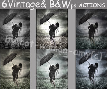
Post for GCU Community Blog Definition from Reference.com: “Retro is a term used to describe, denote or classify culturally outdated or aged trends, modes, or fashions, from the overall postmodern past, but have since that time become functionally or superficially the norm once again. The use of “retro” style iconography and imagery interjected into American postmodern art, advertising, mass media, etc. has occurred from around the time of the U.S. industrial revolution to present day.” ... Read Full Article & Get Links
0 Comments
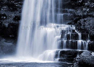
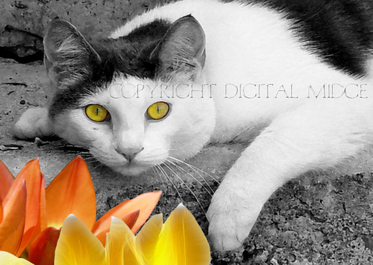
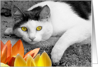
 Part 3 Creative Tinting and Toning Published November 7th, 2011 Creative Tinting: When & How to Apply it Hand-colored photographs were most popular in the mid to late 19th century before the invention of color photography and in the years since has evolved as a technique in the photographic arts using digital tools. I myself in a previous life, spent many hours painstakingly applying Marshall oils with q-tips and cotton swabs. The results were always wonderful and worth the effort, even when you needed to go back to the darkroom for a new print and start over. Today this hand-selective coloring of photographs can be done simply and easily using digital tools. Another pleasing effect from past eras is toning. Applying a tint to a black and white photograph to change the mood. Most commonly used was Sepia toning and I'm glad this tone in particularly can be applied digitally now. In a real darkroom back in the day, toning sepia prints meant breathing in an absolutely horrid rotten egg smell! I have vivid memories of being a child and going to work with my mother who worked in a commercial photographic processing lab with large rocking tanks and cradles. So in this lens we are going to talk about both hand-tinting and toning photographs. I'll show examples of what works and talk about why. Let's start with Toning photographs. ..................................................... The definition of TONING: A darkroom technique used to alter the blacks of a black & white image to a selected color of choice. Toning began in the old-fashioned darkroom, so the paper base was not affected by the toning leaving the whites, white. The most commonly used tones of that era were sepia and blue. Today, toning can be achieved digitally using most software’s hue/saturation settings, duo-tone processing and any number of other techniques. The key here is that in order for toning to look professionally applied and pleasing to the eye, you must take in these things into considerations 1) Does my subject match the mood of the color-tone I wish to apply? 2) Have my whites in the photograph remained white to ensure I have successfully toned my photograph? Color = Emotion When choosing to tone your photographs using the techniques I offer here, it is imperative that for your final imagery to be wildly accepted by your viewing audience that you match the color of tone to be applied to the subject. A Red tone on a child running in a meadow for example doesn’t really make any sense considering red to most people represent strong emotions not usually associated with children. Just as in most cases animals are not good choices for toning blue, it’s an unnatural color for animals. For example; turkeys are associated with Thanksgiving and when we think of Thanksgiving we think of warm fall colors, so if we saw a blue toned turkey our minds would reject that rather than embrace it. It’s important to remember the feelings evoked in the viewer through color when choosing to tone a photograph and also keep in mind that not all subjects are appealing when toned in the wrong color. Yellow and green toning for example are not very appealing when the subject is a person or an animal. There are always exceptions, but if the person’s skin is part of the photograph and you tone it yellow or green, viewers will reject this image because we immediately think of illness, same often applies to animals (those with fur anyway).
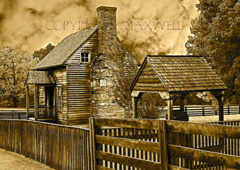
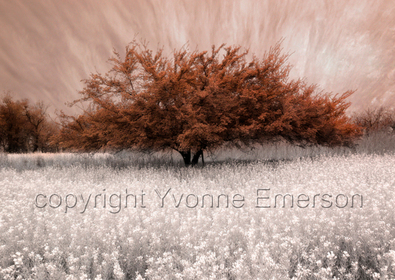
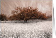
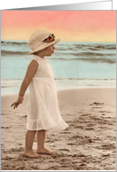
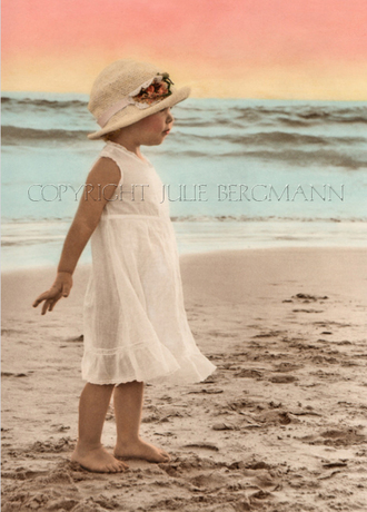
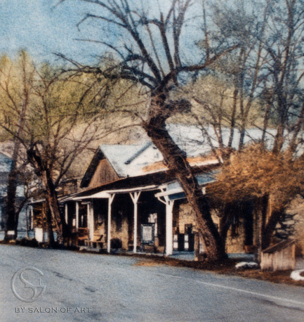
Sepia Tones 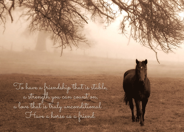 Original Photograph by Doreen Erhardt and the St. George Salon of Art, LLC In photo-toning, a brown tone would be referred to as a Sepia tone offering feelings of wholesomeness, organic and down-to-earth. Sepia tones are now considered a vintage look and are often a very pleasant effect on almost any subject matter. True Sepia from the past leans more towards the red hues which is what I tend to apply as in the horse image above, however over the years Sepia tones have been used with more of a yellowish tint. Brown is a disguise that can be used to effectively hide your true nature, so it’s no wonder that it’s a good choice to hide a lack of harmony in a photograph’s true colors.
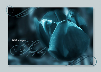
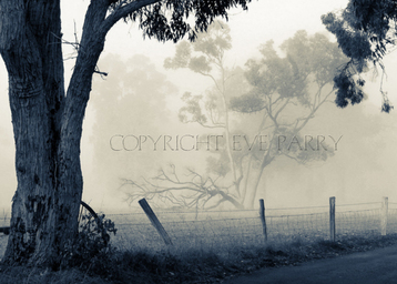
Red and Green Tones In general, both of these colors are poor choices for toning. Though they are colors which portray emotions, there aren’t very many photographic subject that will tolerate the use of these two colors throughout the image. GREEN: Greens offer a sense of renewal, harmony and growth. It is the color associated with peace and ecology. Be aware however of the bilious institutional side of green which can conjure up negative emotions. Green can be soothing and alleviate depression and anxiety. Green toned photographs unless they are of grasses or trees tend to make most subjects look ill. RED: Red tones stimulate feelings that are passionate, exciting and confident. They can also evoke negative feelings and a sense of danger. Red can draw attention and focus to a particular element to increase enthusiasm. Red toned photographs, with the exception of flowers and some types of still life compositions have a tendency to look like Armageddon. Therefore these two tones are rarely used by professional photographers. 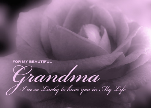 Original Photography by Doreen Erhardt and the St. George Salon of Art, LLC The color purple takes on the characteristics of both red and blue embodying the balance of the unrest which red evokes with the serenity of blue. Purple makes us think of royalty, offers a sense of spirituality and can encourage creativity. It is a contemporary color which can be uplifting. Also choose purple when you want to encourage fantasy, mystery and imagination.
Split Toning - Split Toning in Photoshop by Yanik's Photo School The term "split toning" means we'll be adding a color tint to the highlights using one color, and then using a different color to tint the shadows. The two colors you use can be similar, giving you a subtle effect, or they can be complete opposites. It's really up to you and the effect you're going for. Whichever colors you choose, split toning an image can be a great way to add more visual interest to a black and white photo. Mastering the Art of Black and White Toning by Andrew Gibson The good news is that it's easy to add color to black and white images. Photographers have been doing it for decades, both in the darkroom and digitally, through a process called toning. Breathtaking Split Toning Effect by TPulse Find out how to make your photos look breathtaking with this classic split toning effect. More BEAUTIFUL examples of toning.
Traditional Hand Tinting Photographs
Restoring and Hand-Coloring in Photoshop The thing I particularly like about it is that it not only looks like a "real" hand-tinted photograph, but the technique is actually quite similar to that used with photographic paints (apart from having the benefits of zoom and undo). While I'm using a black and white photo of my grandparents' wedding day back in 1944, you could also use any colored image, desaturated, and follow the same process to provide a unique look. Old-Fashioned, Hand-Tinted Photo Effect Written By Steve Patterson
In this Photoshop Effects tutorial, you'll learn how to easily create an old-fashioned, hand-tinted photo effect. All it takes is an adjustment layer, a layer blend mode, some blurring, a slider bar, and a couple of minutes of your time. |
Resources
Here we archive our Photo Tips, Tutorials, Marketing Tips and Preset Downloads from all our sites. ENJOY! Categories
All
My favorite
|


|
|

Commercial License Holder
|

Salon of Art
on Red bubble