 Dash of Inspiration
Post for GCU Community Blog This may be the most common Typography area where artists will receive returns and/or declines. As stated in the guidelines, when you slap text over the image rather than placing it where it’s easy to read and well-balanced with the elements in the design, the card simply looks unprofessional. Not mentioned, but also a cause for decline if not done well is vertical text which does not work the majority of the time. When it’s pulled off, it’s done so with a very ... Read Full Article
0 Comments
 Dash of Inspiration
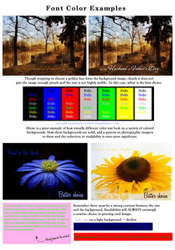
Post for GCU Community Blog Inexperienced greeting card designers have a tendency to want the text color to be some color within the design when it may not be as legible or standout as well as a simple choice of white or black. Here are some simple tips to follow from the professionals ... Read Full Article 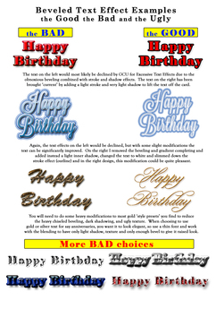 Dash of Inspiration
Post for GCU Community Blog Sometimes it’s hard to resist the urge to apply cool and awesome effects to your text, but on greeting cards these effects must be used with a very light hand or it simply overwhelms the design. Design trends apply to typography as they do to any other phase of design, so greeting card designers must pay attention in order to stay current and create designs which are marketable in ... Read Full Article 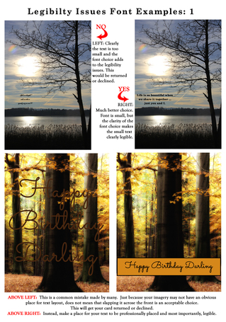 Dash of Inspiration
Post for GCU Community Blog It may seem at first glance that legibility and readability are the same thing, but they are not. Legibility refers to the design of the typeface, as in the width of the strokes, whether or not it has serifs, the presence of type design elements etc. It is easy to tell one letter-form from another in a legible typeface. For instance, decorative typefaces have low legibility because they are primarily meant to be seen at a glance, rather than read at length. Conversely, typefaces designed for books and newspapers have very high legibility. You need to design the overall legibility based on the function of the text within ... Read Full Article 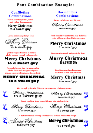 Dash of Inspiration
Post for GCU Community Blog These examples and tips are what GCU speaks to in their submission guidelines and are good rules to follow as a designer. Incorporating great typeface combinations into your card designs is an art, not a science. As with all forms of art, there are no absolute rules to follow, but it is crucial that you understand and apply best practices when combining fonts within your designs. The farther apart the typeface styles you wish to combine are the more luck you’ll have creating a pleasing design. Fonts that are too similar look horrible together. If you are combining fonts you want to shoot for contrast and harmony while avoiding ... Read Full Article 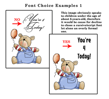 Dash of Inspiration
Post for GCU Community Blog We’ve talked a lot about Typography, offered links to a ton of good font choices and touched on typography layout within your card design … more articles on all of these subjects exist in the Community Blog, but let’s narrow in on Font Choice today and how the wrong choice can cause declines and the difference between a marketable design and an unmarketable design. Such as ... Read Full Article  ©Doreen Erhardt Dash of Inspiration
Post for GCU Community Blog To be successful, this is such a critical element in greeting card design. Though there certainly is some percentage of people who lean more toward blank cards so they can add their own heartfelt message, it is a minute percent of the average greeting card buyer ... Read Full Article 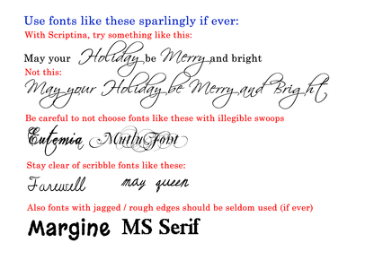 Dash of Inspiration
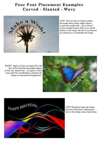
Post for GCU Community Blog Welcome to the Season Finale of ‘Diaries of a Fontaholic’. In today’s segment I’ll share some font tips that can make the difference between a professional greeting card, and a greeting card which looks amateurish … based solely on your choice of font and placement. We’ve chatted before about placement, kerning, etc., so be sure to check out ... Read Full Article & Get Links! 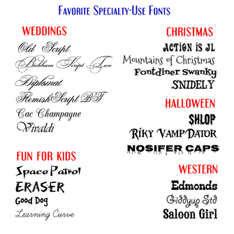 Dash of Inspiration
Post for GCU Community Blog Welcome to the third installment of ‘Diaries of a Fontaholic’. I decided that it was better to split today’s segment into two weeks, so next week will be the final installment where I’ll share some font tips that can make the difference between a professional greeting card, and a greeting card which looks amateurish … based solely on your choice of font and placement. Today, in Part-3, I’ll be introducing you to ... Read Full Article & Get FONTS 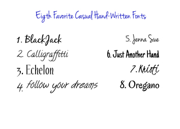 Dash of Inspiration
Post for GCU Community Blog Welcome to ‘Diaries of a Fontaholic Part 2′. Today I’ll be introducing you to my 8 Favorite ‘hand-written’ casual fonts. These are a great choice for when your design and category call for a more ‘intimate’ connection; also often a better choice for masculine cards, rather than choosing a fancy script font which can be considered by some to be a bit feminine. Also, my Nine Favorite replacements for Comic-Sans. All terrific choices for your humorous designs. Here we go … Read Full Article & GET FONTS! |
Resources
Here we archive our Photo Tips, Tutorials, Marketing Tips and Preset Downloads from all our sites. ENJOY! Categories
All
My favorite
|


|
|

Commercial License Holder
|

Salon of Art
on Red bubble