 Dash of Inspiration
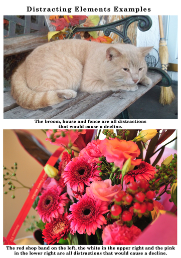
Post for GCU Community Blog So let’s talk about Composition: Unprofessional Distracting Elements and/or Background: This really should be fairly easy to understand. It does apply mostly to photographs, though could apply to digital compositions as well. It’s one of those Photography 101 lessons to compose your photograph without things like; poles sticking out of the heads of your subjects, branches and dead leaves in front of your subject, body parts that don’t belong to your subject, etc. Remember; if it does not add to your overall image then it’s a distraction ... Read Entire Article
0 Comments
Dash of Inspiration Post for GCU Community Blog Let’s continue with a visual review and discussion of the areas listed in GCU’s Submission Guidelines. Today we’ll keep this series going with the second area in the COMPOSITION grouping of the Submission Guidelines which is: COMPOSITION: Balance of Elements The Submission Guidelines state this: A feeling of visual equality. Objects, values, colors, textures, shapes, forms, etc., are used in creating balance in a composition. Balance is a visual interpretation of gravity in the design. Large, dense elements appear to be heavier while smaller elements appear to be lighter. In art ... Read Entire Article  Dash of Inspiration Post for GCU Community Blog I thought it might be helpful to have a series that addresses each (or many) of the areas listed in the Submission Guidelines. I’ll to offer some visuals and perhaps more details that might be beneficial to offer a better understanding of these categories. Today we’ll start this series off with the first main grouping of the Submission Guidelines which is: COMPOSITION: Subject Matter ... Read Full Article & See More Examples 
Photo courtesy of Petr Kratochvil Example of Poor Angle
Dash of Inspiration Post for GCU Community Blog Many of us like to work with old vintage images and they’re a great source for greeting card designs, but leaving a vintage photo or image as is and using it with all it’s faults does not usually make for a good greeting card. Cleaning up and improving spots, poor contrast, scratches and in general poor image quality does not mean you are losing the ‘vintage’ feel of the image and ... Read Entire Article 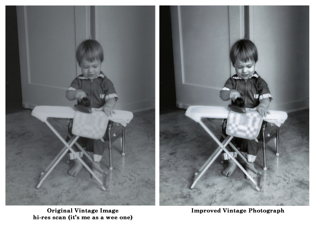 The Zone System I had the pleasure of studying Ansel Adams Zone System in a 2-Year College Course during my photography classes and found it to simply amazing and those skills I still apply to my color and digital photography. Every photographer who wishes to pursue a professional career in this medium should study the Zone System and understand how to apply it to their craft. 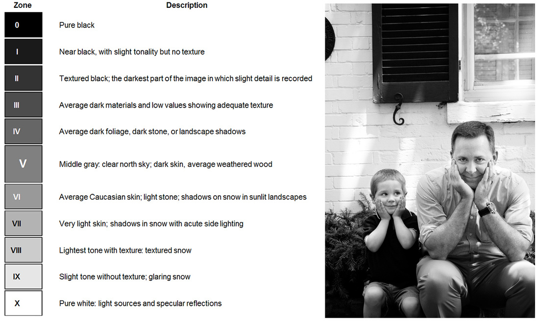 Image Courtesy of: Liz’s Cinematography 101: Measuring Light The Zone System provides photographers with a systematic method of precisely defining the relationship between the way they visualize the photographic subject and the final results. Although it originated with black-and-white sheet film, the Zone System is also applicable to roll film, both black-and-white and color, negative and reversal, and to digital photography . . .
Read Photo Tuts nice overview of the Zone System Then go learn more ... you owe it to your photography career!  ©Doreen Erhardt Dash of Inspiration
Post for GCU Community Blog The amateur photographer absolutely must have constant critique of their work in order to grow. It’s simply impossible to see what areas you need to improve unless you have a trained eye. Any photographer that isn’t taking advantage of critique by professional photographers is effectively stunting their growth. With the internet today, there is a wealth of sites where the photographer can get critique online by a panel of professionals ... Read Full Article & Get Links  ©Doreen Erhardt Dash of Inspiration
Post for GCU Community Blog To be successful, this is such a critical element in greeting card design. Though there certainly is some percentage of people who lean more toward blank cards so they can add their own heartfelt message, it is a minute percent of the average greeting card buyer ... Read Full Article 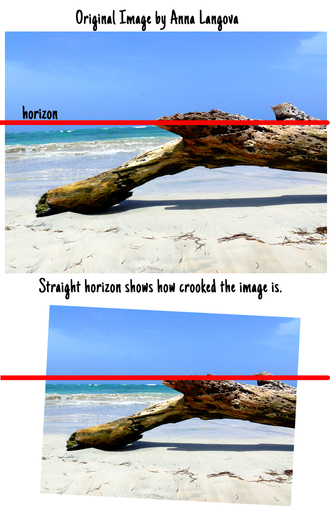 Dash of Inspiration Post for GCU Community Blog First let’s talk about the horizon line in visual art. If you’ve ever taken a beginner’s drawing class, one of the first things you’ll be taught when learning how to draw is to first establish your Horizon Line by drawing a faint horizontal line on the paper. In photography, the subject of today’s discussion, the same theory applies when framing through the viewfinder. A Straight Horizon is one of the first things taught in a beginning photography class ... Read Full Article & Get Tutorial Links  ©Doreen Erhardt Dash of Inspiration
Post for GCU Community Blog When you put your copyright on your image front, here are some things to consider: Never spell out copyright, not only is this unnecessary, it’s adding a lot of text to the front of your card that stands out and is rather unappealing to the consumer … I mention this because there are some of you who do this, in rather large text. For those who don’t know how to make the © symbol, here’s how ... Read Full Article 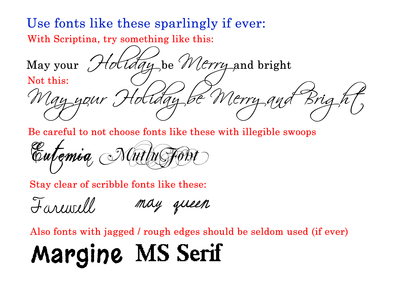 Dash of Inspiration
Post for GCU Community Blog Welcome to the Season Finale of ‘Diaries of a Fontaholic’. In today’s segment I’ll share some font tips that can make the difference between a professional greeting card, and a greeting card which looks amateurish … based solely on your choice of font and placement. We’ve chatted before about placement, kerning, etc., so be sure to check out ... Read Full Article & Get Links! |
Resources
Here we archive our Photo Tips, Tutorials, Marketing Tips and Preset Downloads from all our sites. ENJOY! Categories
All
My favorite
|


|
|

Commercial License Holder
|

Salon of Art
on Red bubble