 Dash of Inspiration
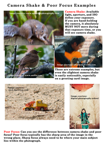
Post for GCU Community Blog The majority of images that fall into the area of declines for lack of sharpness/clarity are photographs and those with photographic elements, so this is the primary discussion here, however; it goes without saying that if you have scanned or photographed your artwork and the results are not crisp and sharply focused, those too ... Read Full Article
0 Comments
 Dash of Inspiration
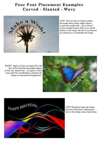
Post for GCU Community Blog This may be the most common Typography area where artists will receive returns and/or declines. As stated in the guidelines, when you slap text over the image rather than placing it where it’s easy to read and well-balanced with the elements in the design, the card simply looks unprofessional. Not mentioned, but also a cause for decline if not done well is vertical text which does not work the majority of the time. When it’s pulled off, it’s done so with a very ... Read Full Article 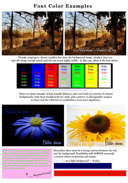 Dash of Inspiration
Post for GCU Community Blog Inexperienced greeting card designers have a tendency to want the text color to be some color within the design when it may not be as legible or standout as well as a simple choice of white or black. Here are some simple tips to follow from the professionals ... Read Full Article 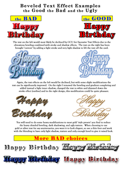 Dash of Inspiration
Post for GCU Community Blog Sometimes it’s hard to resist the urge to apply cool and awesome effects to your text, but on greeting cards these effects must be used with a very light hand or it simply overwhelms the design. Design trends apply to typography as they do to any other phase of design, so greeting card designers must pay attention in order to stay current and create designs which are marketable in ... Read Full Article 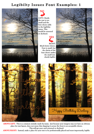 Dash of Inspiration
Post for GCU Community Blog It may seem at first glance that legibility and readability are the same thing, but they are not. Legibility refers to the design of the typeface, as in the width of the strokes, whether or not it has serifs, the presence of type design elements etc. It is easy to tell one letter-form from another in a legible typeface. For instance, decorative typefaces have low legibility because they are primarily meant to be seen at a glance, rather than read at length. Conversely, typefaces designed for books and newspapers have very high legibility. You need to design the overall legibility based on the function of the text within ... Read Full Article 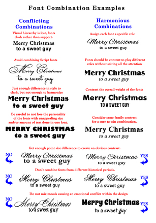 Dash of Inspiration
Post for GCU Community Blog These examples and tips are what GCU speaks to in their submission guidelines and are good rules to follow as a designer. Incorporating great typeface combinations into your card designs is an art, not a science. As with all forms of art, there are no absolute rules to follow, but it is crucial that you understand and apply best practices when combining fonts within your designs. The farther apart the typeface styles you wish to combine are the more luck you’ll have creating a pleasing design. Fonts that are too similar look horrible together. If you are combining fonts you want to shoot for contrast and harmony while avoiding ... Read Full Article 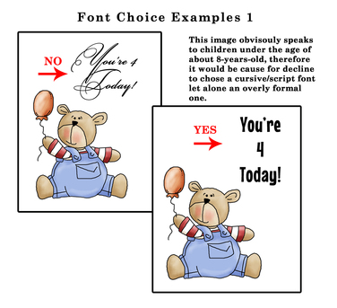 Dash of Inspiration
Post for GCU Community Blog We’ve talked a lot about Typography, offered links to a ton of good font choices and touched on typography layout within your card design … more articles on all of these subjects exist in the Community Blog, but let’s narrow in on Font Choice today and how the wrong choice can cause declines and the difference between a marketable design and an unmarketable design. Such as ... Read Full Article 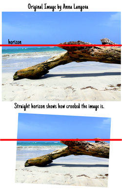 Dash of Inspiration
Post for GCU Community Blog We’ve recently discussed this topic in a previous post, but to keep things all together in this series we’ll use some of the examples of previous posts here as well. Tilted Horizons: If you’ve ever taken a beginner’s drawing class, one of the first things you’ll be taught when learning how to draw is to first establish your Horizon Line by drawing a faint horizontal line on the paper. In photography, the subject of today’s discussion, the same theory applies when framing through the viewfinder. A Straight Horizon is one of the first things taught in a beginning photography ... Read Full Article 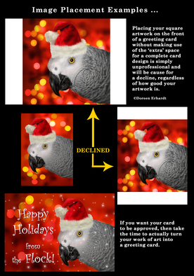 Dash of Inspiration
Post for GCU Community Blog So let’s talk about Composition: Framing/Alignment Image Dimensions: Placing a square image on a rectangle card front without working to transform the image into a 5×7 card design just looks unprofessional, yet artists do it every day. Anytime an artist is going to put their imagery on a product, they absolutely MUST modify the image appropriately to fit the products dimensions. At GCU, this ‘slapping’ of artwork without modifications are no longer acceptable. Here are some ... Read Entire Article 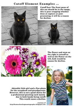 Dash of Inspiration
Post for GCU Community Blog So let’s talk about Composition: Placement and Position Elements which are cut off: This becomes most common when talking about cutting off hands, feet, ears, and noses of animals and people, as well as cutting off flower petals which visually are critical to the image. Artists who draw and paint don’t do this unless it’s part of their concept, in which case it always looks correct to the viewer. Photographers however, when cropping or trying to remove distractions, both during capture and just as frequently after-processing, sometimes cutoff parts of the image which ... Read Entire Article |
Resources
Here we archive our Photo Tips, Tutorials, Marketing Tips and Preset Downloads from all our sites. ENJOY! Categories
All
My favorite
|


|
|

Commercial License Holder
|

Salon of Art
on Red bubble