 Dash of Inspiration
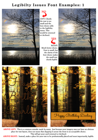
Post for GCU Community Blog It may seem at first glance that legibility and readability are the same thing, but they are not. Legibility refers to the design of the typeface, as in the width of the strokes, whether or not it has serifs, the presence of type design elements etc. It is easy to tell one letter-form from another in a legible typeface. For instance, decorative typefaces have low legibility because they are primarily meant to be seen at a glance, rather than read at length. Conversely, typefaces designed for books and newspapers have very high legibility. You need to design the overall legibility based on the function of the text within ... Read Full Article
0 Comments
Your comment will be posted after it is approved.
Leave a Reply. |
Resources
Here we archive our Photo Tips, Tutorials, Marketing Tips and Preset Downloads from all our sites. ENJOY! Categories
All
My favorite
|


|
|

Commercial License Holder
|

Salon of Art
on Red bubble