 Dash of Inspiration
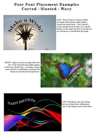
Post for GCU Community Blog This may be the most common Typography area where artists will receive returns and/or declines. As stated in the guidelines, when you slap text over the image rather than placing it where it’s easy to read and well-balanced with the elements in the design, the card simply looks unprofessional. Not mentioned, but also a cause for decline if not done well is vertical text which does not work the majority of the time. When it’s pulled off, it’s done so with a very ... Read Full Article
0 Comments
Your comment will be posted after it is approved.
Leave a Reply. |
Resources
Here we archive our Photo Tips, Tutorials, Marketing Tips and Preset Downloads from all our sites. ENJOY! Categories
All
My favorite
|


|
|

Commercial License Holder
|

Salon of Art
on Red bubble